


Salesforce-Tableau-Data-Analyst Exam Questions With Explanations
The best Salesforce-Tableau-Data-Analyst practice exam questions with research based explanations of each question will help you Prepare & Pass the exam!


Over 15K Students have given a five star review to SalesforceKing


Why choose our Practice Test
By familiarizing yourself with the Salesforce-Tableau-Data-Analyst exam format and question types, you can reduce test-day anxiety and improve your overall performance.
Up-to-date Content
Ensure you're studying with the latest exam objectives and content.
Unlimited Retakes
We offer unlimited retakes, ensuring you'll prepare each questions properly.
Realistic Exam Questions
Experience exam-like questions designed to mirror the actual Salesforce-Tableau-Data-Analyst test.
Targeted Learning
Detailed explanations help you understand the reasoning behind correct and incorrect answers.
Increased Confidence
The more you practice, the more confident you will become in your knowledge to pass the exam.
Study whenever you want, from any place in the world.

Salesforce Salesforce-Tableau-Data-Analyst Exam Sample Questions 2026
Start practicing today and take the fast track to becoming Salesforce Salesforce-Tableau-Data-Analyst certified.
21754 already prepared
Salesforce 2026 Release175 Questions
4.9/5.0
You have the following visualization.
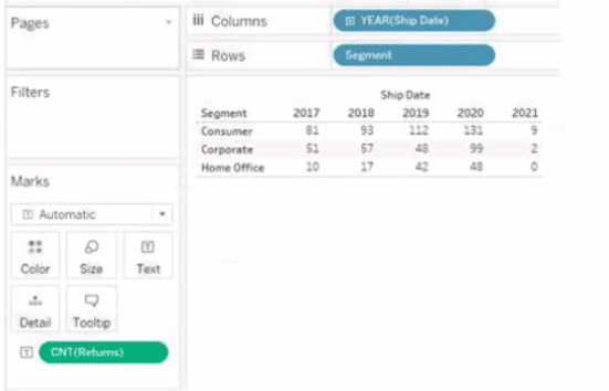
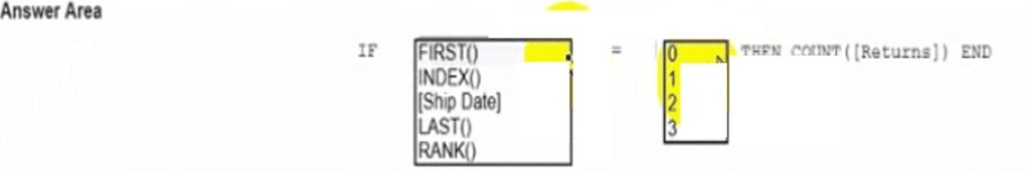

Explanation:
This question tests your knowledge of Table Calculation Functions used as filters to manipulate visual layouts without altering the underlying data cache (often called "late filtering").
The Core Logic: When you use a standard dimension filter like [Ship Date] = 2019, Tableau filters out all other rows from the underlying query cache before calculating table aggregates. If you want to only show 2019 while preserving look-back table structures, you must use a table calculation function.
The Calculation Mechanics: * LAST() returns the number of rows from the current row to the last row in the partition. Since 2021 is the final column, its LAST() index is 0. Moving backwards, 2020 is 1, and 2019 is 2.
Therefore, writing IF LAST() = 2 THEN COUNT([Returns]) END successfully isolates the column corresponding to the year 2019.
Why Other Options Are Incorrect:
Selecting [Ship Date] in the first dropdown:
Placing a standard dimension directly inside a positional table calculation syntax like IF [Ship Date] = ... evaluates as a standard row-level logical check, which changes the data partition instead of utilizing positional indexing properties.
Selecting INDEX() or FIRST() with incorrect offset numbers:
While INDEX() and FIRST() can target specific columns, their numbering scales would require different numeric targets (e.g., INDEX() = 3 for 2019 since 2017=1, 2018=2, 2019=3), making the option combination of [Ship Date] = 2 structurally incorrect.
Selecting RANK():
RANK() requires an expression argument to order values by magnitude (e.g., highest returns to lowest), which cannot be used to isolate an ordered time series column.
References:
Tableau Documentation (Table Calculation Functions): "LAST() - Returns the number of rows from the current row to the last row in the partition. The last row returns 0."
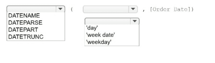
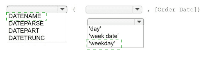
You have a table that contains four columns named Order Date, Country, Sales, and Profit.
You need to add a column that shows the day of the week for each row. For example,
orders placed on August 31, 2022, will show a day of
Wednesday.
How should you complete the formula? (Use the dropdowns in the Answer Area to select
the correct options to complete the formula.)
Explanation:
To return a specific calendar part of a date as a descriptive text string—such as the full name of the day of the week ("Wednesday")—Tableau uses the DATENAME function paired with a literal date part parameter.
The Function Type (DATENAME vs DATEPART):
DATENAME returnsthe specified date part as a string character value ('Wednesday').
DATEPART returns the specified date part as a numeric integer value (4 for Wednesday, assuming Sunday is 1). Since the requirement explicitly asks to show the day string "Wednesday", DATENAME is the correct selection.
The Date Part Syntax ('weekday'): * In Tableau, specifying the literal string 'weekday' tells the date engine to parse out the cyclical name of the day (Sunday through Saturday) matching that exact calendar timestamp.
Why Other Options Are Incorrect:
DATEPART: As noted above, this would output a raw integer value (e.g., 4) rather than the literal string name ("Wednesday"), failing to meet the format requirement.
DAY: The DAY() function is a shorthand expression that returns the numerical day of the month as an integer (e.g., passing August 31, 2022, into DAY() yields the integer 31).
DATETRUNC:This rounds or truncates a date timestamp back to the absolute starting line of a specified date part interval (e.g., truncating a date to the week level returns the date value of that week's starting Sunday, 2022-08-28 00:00:00).
References:
Tableau Documentation (Date Functions): "DATENAME(date_part, date, [start_of_week]) returns the specified part of the date as a string, where the date_part is an expression like 'month' or 'weekday'."
Tableau Product Manual (Date Parts Reference Table): The string literal argument 'weekday' is natively reserved in Tableau's calculation engine to explicitly isolate day-of-week string evaluations.
You want to create the following table in a view.
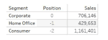
Which function should you use to create the Position column?
A. RANK
B. FIRST
C. INDKX
D. LAST
Explanation:
The Position column in the table shows the relative position of each Segment, with the highest value (Consumer) at position -2, Home Office at -1, and the lowest value (Corporate) at 0. This indicates that the position is determined by the Sales measure, with the highest Sales value receiving the lowest (most negative) position.
Why FIRST is correct:
FIRST() is a table calculation function that returns the position of the current row relative to the first row in the partition.
In this view, the partition is the entire table (since there are no other dimensions breaking it up), and the table is sorted by Sales in descending order.
FIRST() returns 0 for the first row (the highest Sales), -1 for the second row, -2 for the third row, etc.
This exactly matches the Position column: Corporate (Sales 706,146) → 0, Home Office (429,653) → -1, Consumer (1,161,401) → -2.
Why other options are incorrect:
A. RANK:
RANK() returns the rank of the current row (e.g., 1, 2, 3) based on a measure. It does not produce negative numbers or the 0, -1, -2 pattern. Ranks are positive integers (1, 2, 3).
C. INDEX:
INDEX() returns the index of the current row (e.g., 1, 2, 3) in the partition, starting from 1. It does not produce negative numbers and does not start at 0.
D. LAST: LAST() returns the position relative to the last row in the partition. For the last row, it returns 0; for the second-to-last, it returns -1; for the third-to-last, it returns -2. If the table were sorted in ascending order, this could produce the pattern shown, but with the sorting in the image (highest Sales first), LAST() would give a different ordering.
Reference:
Tableau Help: FIRST() Function – "FIRST returns the number of rows from the current row to the first row in the partition. For the first row in the partition, this is 0.
You have the following dashboard that contains two visualizations
You want to show only one visualization at time. Users must be able to switch between
visualizations.
What should you me?
A. A parameter and a calculated filed
B. Worksheet actions
C. Show/hide buttons
D. Dashboard actions
Explanation:
You have a dashboard with two visualizations, and you want to display only one at a time, with the user able to switch between them.
The most direct and user-friendly way to achieve this in Tableau is to place both worksheets on the dashboard as floating objects, stack them on top of each other, and then add Show/Hide buttons (using the drop-down arrow on each floating container).
Why the other options are incorrect:
A. A parameter and a calculated field
– This is a valid technique for showing/hiding content, but it is typically used to conditionally show/hide within a single worksheet (e.g., switching between measures on a single chart) or to control which field appears on an axis. It is more complex and less intuitive for the simple use case of toggling between two entirely separate visualizations on a dashboard. While possible, it is not the best or most direct method.
B. Worksheet actions
– Worksheet actions (like "Go to Sheet") are used to navigate between different sheets/tabs in the workbook or to filter/highlight data points. They do not control the visibility of objects on a single dashboard layout.
D. Dashboard actions
– Dashboard actions are used for cross-filtering, highlighting, or URL navigation between dashboard objects. They do not have a built-in feature to toggle the visibility (show/hide) of a worksheet object on the same dashboard.
Reference:
Tableau Official Documentation: Show or Hide a Dashboard Object – This explicitly describes using the drop-down menu on a dashboard object to create a button that shows or hides that object.

Prep Smart, Pass Easy Your Success Starts Here!
Transform Your Test Prep with Realistic Salesforce-Tableau-Data-Analyst Exam Questions That Build Confidence and Drive Success!

Frequently Asked Questions